JavaScript is not currently enabled, but is required for full CodeSonar manual search and browse functionality.
If you are viewing this file in your hub's Web GUI, enable JavaScript in your browser: you will also need it for GUI functionality.
If you opened this file directly from disk, your browser may be directly suppressing JavaScript functionality: certain browsers perform this suppression on local files (but not files delivered by web servers) for security reasons.
| CodeSonar® 9.0p0 Hot Tips | CONFIDENTIAL | CodeSecure Inc |
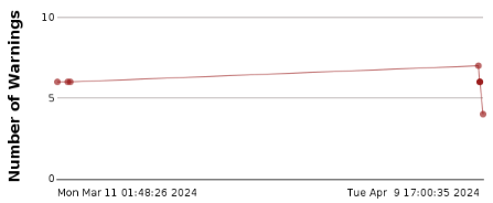
This kind of chart displays the changes in project warning counts over subsequent analyses.
See Charts and Chart Tables: Permissions for details of the permissions that apply to charts and charting operations.
This task will produce a chart similar to the following:
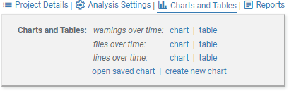
The page will expand to show the available chart and table shortcuts.
The line chart will be displayed in a Chart page.
You might want to edit the chart to display a separate line for each warning class, or to display the change in warning counts over time for a second project on the same set of axes.
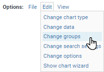
The charting wizard will open with the groups tab displayed.
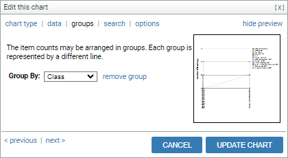
The displayed chart will now have a separate line for each warning class.
Change back to a single warning count line for the whole analysis.
Add another set of data to the graph.
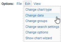
The charting wizard will open with the data tab displayed.
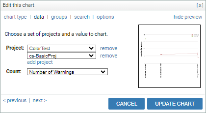
The displayed chart will now have a separate line for each project. Depending on the time periods over which the projects were analyzed, the lines on the chart may not overlap, or may be different lengths.